Improve design with typography
Typography is not just about selecting the font or text size; it's about conveying the intended message to the reader. That's why it's so important to consider the audience you're designing for.
The fonts you choose can hugely impact people's feelings about your design.
For example, sans-serif fonts give off a modern and sleek vibe, while serif fonts feel more traditional and refined.
Typography it's about conveying the intended message to the audience. A company's brand carries reputation and trust.
Professional fonts are designed by experienced designers and offer a wide range of styles and weights. They go through a higher level of quality control to ensure consistency and readability across multiple devices. To avoid overwhelming the viewer with too much information, every design needs a clear hierarchy of information. One way to achieve this is by using different font sizes, styles and colours. This way, you can direct the reader's eye and highlight the most important information.
Grids divide a layout into columns and rows to create a frame of reference for content placement. They thereby help align text and images in a consistent and orderly manner.
There are different types of grids, such as:
- The manuscript grid
- The column grid
- The modular grid
- The baseline grid
- And the hierarchical grid.
Depending on the application, certain types of grids are more suitable than others. For example, a manuscript grid is most often used for book layouts, while a column grid works well for web designs.
Grids can be a useful tool to create a structured layout. However, there's a risk that your design can become too rigid and predictable if you stick too closely to the grid. Breaking the grid can add a surprising element to your design and make it more dynamic and appealing.
When choosing fonts for your design, less is often more. If you use too many different fonts, your design can quickly become cluttered and unprofessional. No more than three is a good rule of thumb when combining fonts.
You can create contrast by combining fonts. But also through the use of different font sizes, colours and weights (eg. bold vs. light). Contrast helps create a clear information hierarchy and directs the reader's eye.
Beginners often make the mistake of neglecting white space. But you don't have to fill every inch with text or images. Often less is more.
White space is the empty space around the design elements. If you use it consciously, you can create a sense of balance and draw the eye to the elements you want them to notice.
A type scale can help you determine the size of headings, subheadings, and other text elements. This creates a visual hierarchy and makes your content easier to read.
Display fonts are specifically designed to look sophisticated and elegant, which makes them the perfect choice for headlines. With their bolder strokes and more intricate details, they can add a refined touch to your designs. But remember to use display fonts only for large text as they become illegible in smaller sizes. Also, beware when choosing fonts for a website. Each font installed can increase the loading time, leading to slower page speeds. So, while it's great to aim for elegance in your typography, it's also important to keep practical considerations in mind. In some cases, faster loading times might outweigh the benefits of using a particular font.
Lead paragraphs are short, eye-catching summaries placed at the beginning of an article. They are designed to grab attention and give your reader a quick overview of what's to come. Lead paragraphs are especially useful for the web, where people tend to skim content. In this case, a lead paragraph can entice readers to delve deeper into an article, even if they're short on time. Plus, they can be a valuable tool for people to share content without having to read the whole piece.
Many people tend to emphasize words on their websites by making them bold. This can make the text harder to read. When too much is calling for attention, it can cause the eyes to jump around the page, making it harder to focus. I suggest using italics instead of bold to highlight. This way, the emphasis is more subtle, and the reader can easily absorb the entire message without distractions.
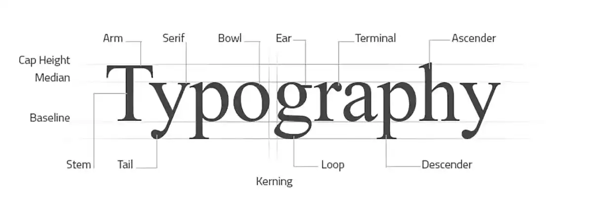
Kerning is about adjusting the spacing between letters to improve the appearance and readability of the text. This is particularly important in logo design or headlines, for example.
Good kerning results in a balanced and uniform typography, while poor kerning can result in awkward spacing that detracts from reading.
Check out the OpenType features and glyphs. They can very quickly enhance your design. They offer a variety of features, such as ligatures, alternate characters and small caps.
Ligatures, for example, are combinations of two or more letterforms that blend seamlessly to create a more appealing image.
Clear punctuation is an essential aspect of successful typography. Proper punctuation helps prevent confusion and ensures your message is conveyed clearly. Make sure you use punctuation marks such as commas, hyphens, and dashes correctly and with the appropriate spacing.


